


Self initiated brief: Create a publication, that is a modernised, re-inspired version of ‘The Fable of The Fox and the Grapes’. Use own example/s of cognitive dissonance.
The re-written fables:
The woman who longed desperately for her nicotine rush,
beholds with pain,
The tempting sticks of death were too delicious to quit;
Dissonance in her mind, she forced a careless smile, set one alight,
And proclaimed, ‘we all die someday’.
beholds with pain,
The tempting sticks of death were too delicious to quit;
Dissonance in her mind, she forced a careless smile, set one alight,
And proclaimed, ‘we all die someday’.
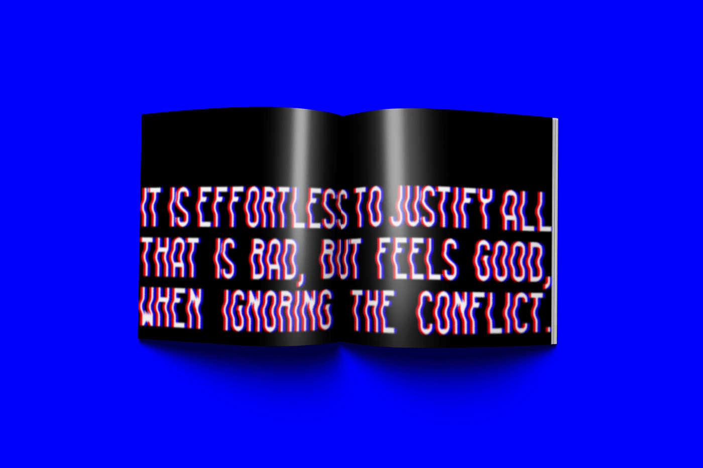
It is effortless to justify all that is bad, but feels good, when ignoring the conflict.
The man who longed for the succulent fix, beholds with pain,
The tantalising cadavers, a craving too intense to tame:
Dissonance plaguing his mind, he forced a careless grin,
began devouring,
And proclaimed, ‘too delectable to bin’.
The tantalising cadavers, a craving too intense to tame:
Dissonance plaguing his mind, he forced a careless grin,
began devouring,
And proclaimed, ‘too delectable to bin’.
It is effortless to justify all that is bad, but feels good, when ignoring the conflict.
Thought process behind the visuals:
Clear themes I have chosen in my work for this publication is distortion and contrast, with a focus on exploring a visual representation of the moment of dissonance, the point of conflict where dissonance occurs. For the artwork to accompany the poetry type work, I utilised distorted orbs in the two selected highly contrasting colours, to illustrate the concept of the conflicting belief and behaviour, and depict the point of contention which is both visually and conceptually intriguing. For the spreads, I decided upon having one page showing the full story (the two entities in conflict) with the point of dissonance removed and placed on the next page as a visual accompaniment to the poem that clearly illustrates the concept on dissonance.
I chose these typefaces to pair well with the modern look I aimed to achieve, they also work extremely well for layering uniform type with distorted in contrasting colours, inspired by anaglyphs. I utilised conflicting statements related to the smoking and meat eating examples of cognitive dissonance I was exploring, in order to convey the dissonance through typography. Through layering the type and contrasting colours, with some effects to highlight the visual point of conflict in the type, I created an overall level of contrast, discomfort and conflict in the design but also a level of legibility so the message is still received. The use of differing versions of the same typeface allowed me to layer the statements directly on top of one another, with the distortion of ‘liquido fluid’ highlighting the dissonance of the conflicting statement without two contrasting typefaces creating too much visual conflict and illegibility.
